


Redesigning the Currency
Many Americans no longer care about physical money like bills or coins. As time goes on, more and more people turn to digital currency, through cards and services like Apple Pay or Venmo.
While some may believe that as the world becomes more digitized, the importance of physical money diminishes, money exists to establish trade and commerce and is more than a few numbers in a bank account or a virtual wallet. Physical money feels more significant when people are deciding whether or not to make a purchase, since they are handing over actual, hard-earned cash.
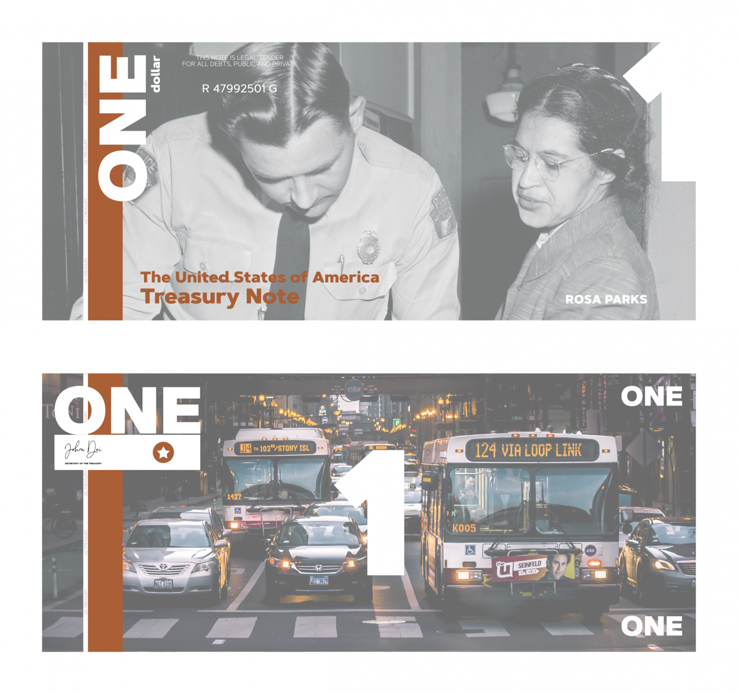
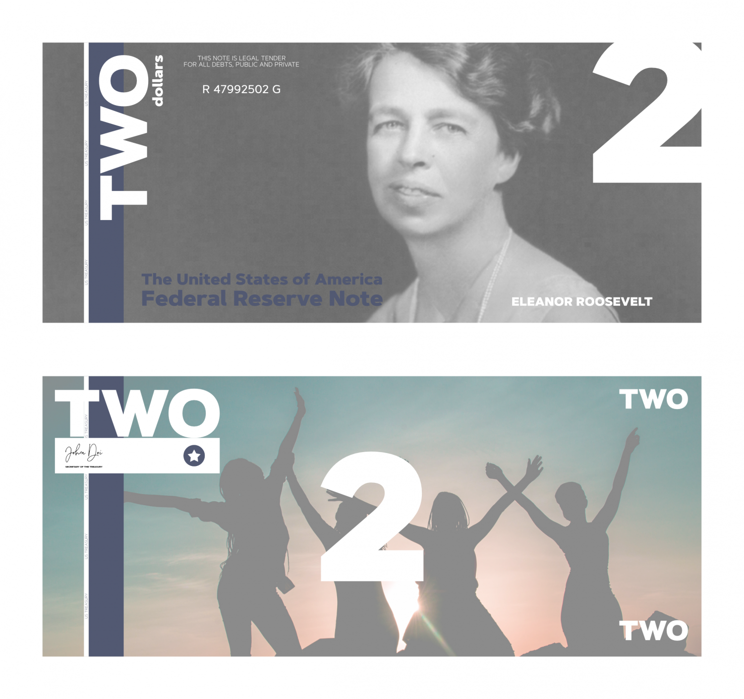
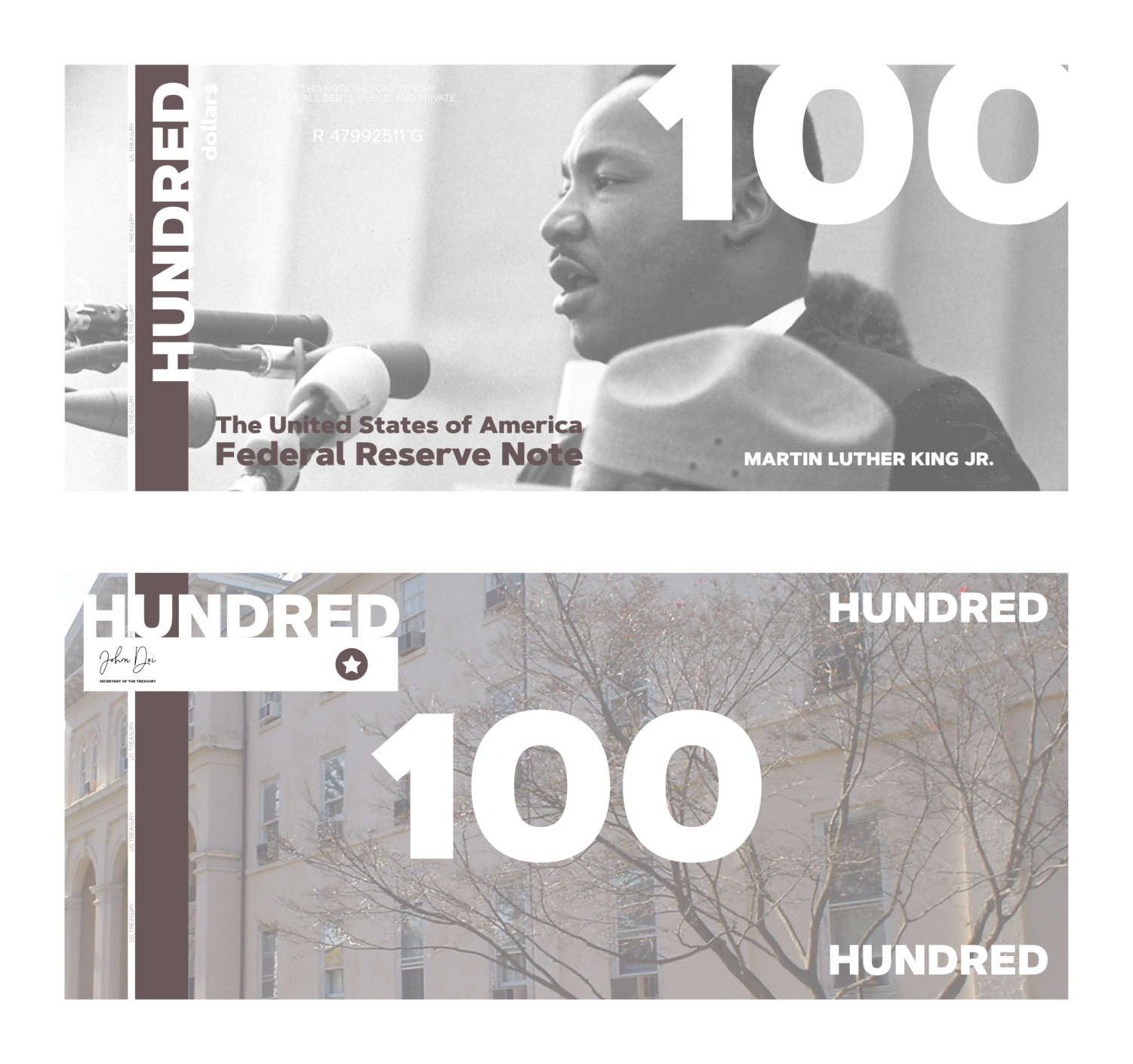
I believe the U.S. currency should be redesigned to better fit with modern society, make it more appealing for consumers and make it easier for all people to conveniently use. I created my own redesigns, which are featured on these two pages.
Many countries throughout the world, such as Canada, Switzerland, Australia, and Latvia, update their currency to match the culture and present time of their society, but not the United States. There have been several redesigns of United States currency over the years, but none of them have been significant. Instead of periodically updating the look of the currency, the United States just updates the security features to decrease the threat of counterfeiting.
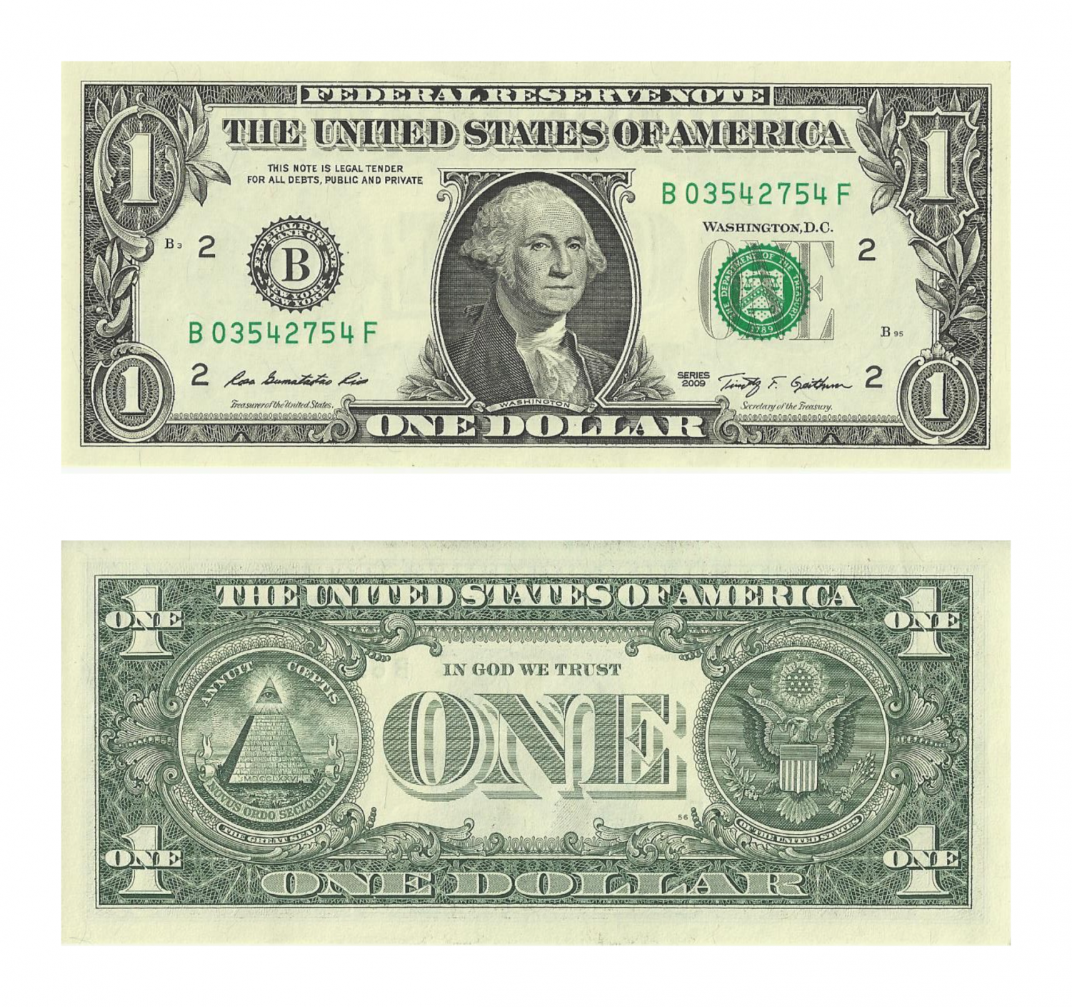
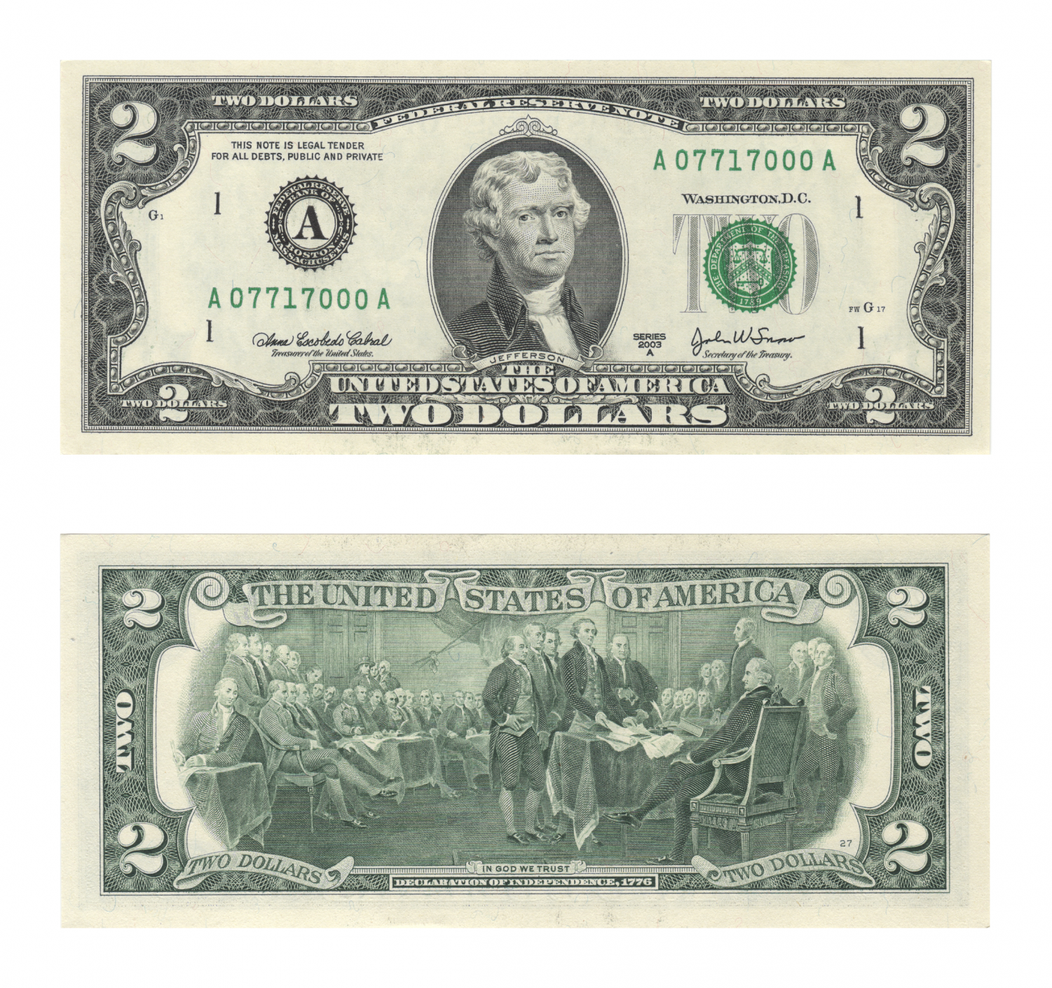
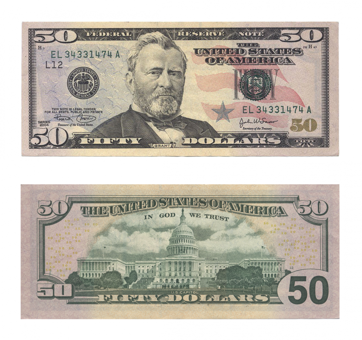
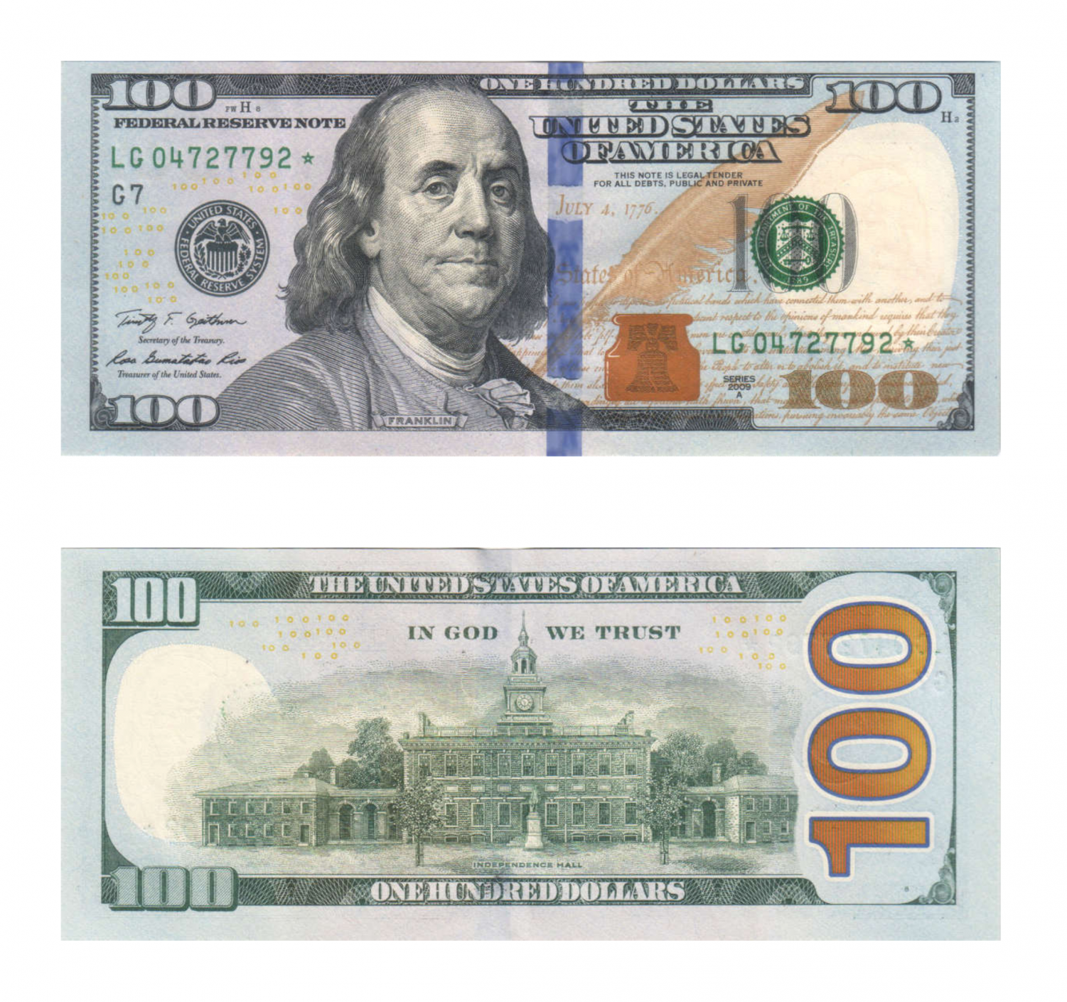
The U.S. currency leaving the U.S. Treasury today looks shockingly similar to what was being printed decades ago. Some of the reasons for the older design of present-day U.S. currency have to do with security. There are several security features implemented within the currency, such as security threads and color-changing ink. If you look on a $100 bill, for example, you will see a textured, blue strip that is designed to make it more difficult for counterfeiters. If you ever look at the brown bell on the right side of this security strip, you will notice that it changes color if it is tilted. Additionally, $100 bills of today include four different shades of ink, which gives them their green color. This makes it extremely difficult for counterfeiters to replicate American currency. U.S. currency can still be more simplified in its design yet maintain the same security features.
U.S. currency includes portraits of past presidents and other notable individuals, like Benjamin Franklin and Alexander Hamilton. Ulysses S. Grant, on the $50 note, is the most modern person on any of the currency, even though he was the 18th president, serving from 1869 to 1877. Given the significance of numerous events and people between Grant’s era and now, American currency needs an update.
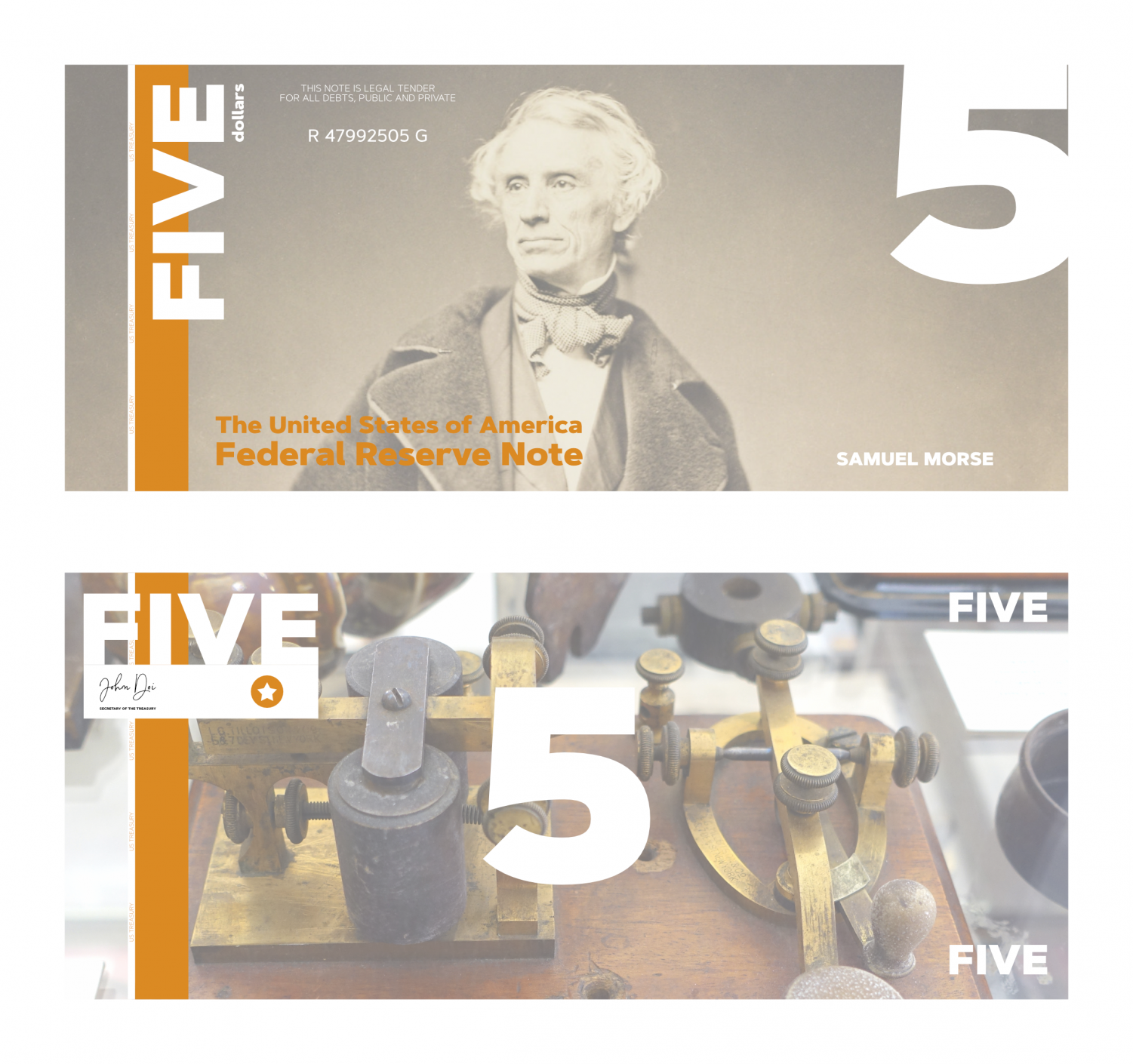
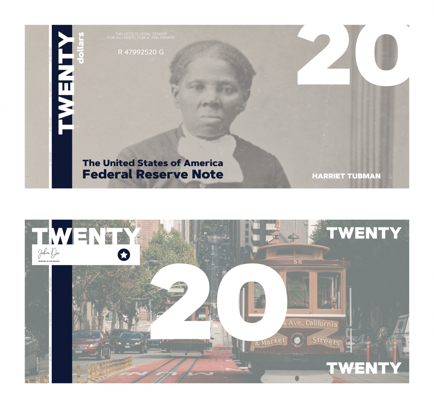
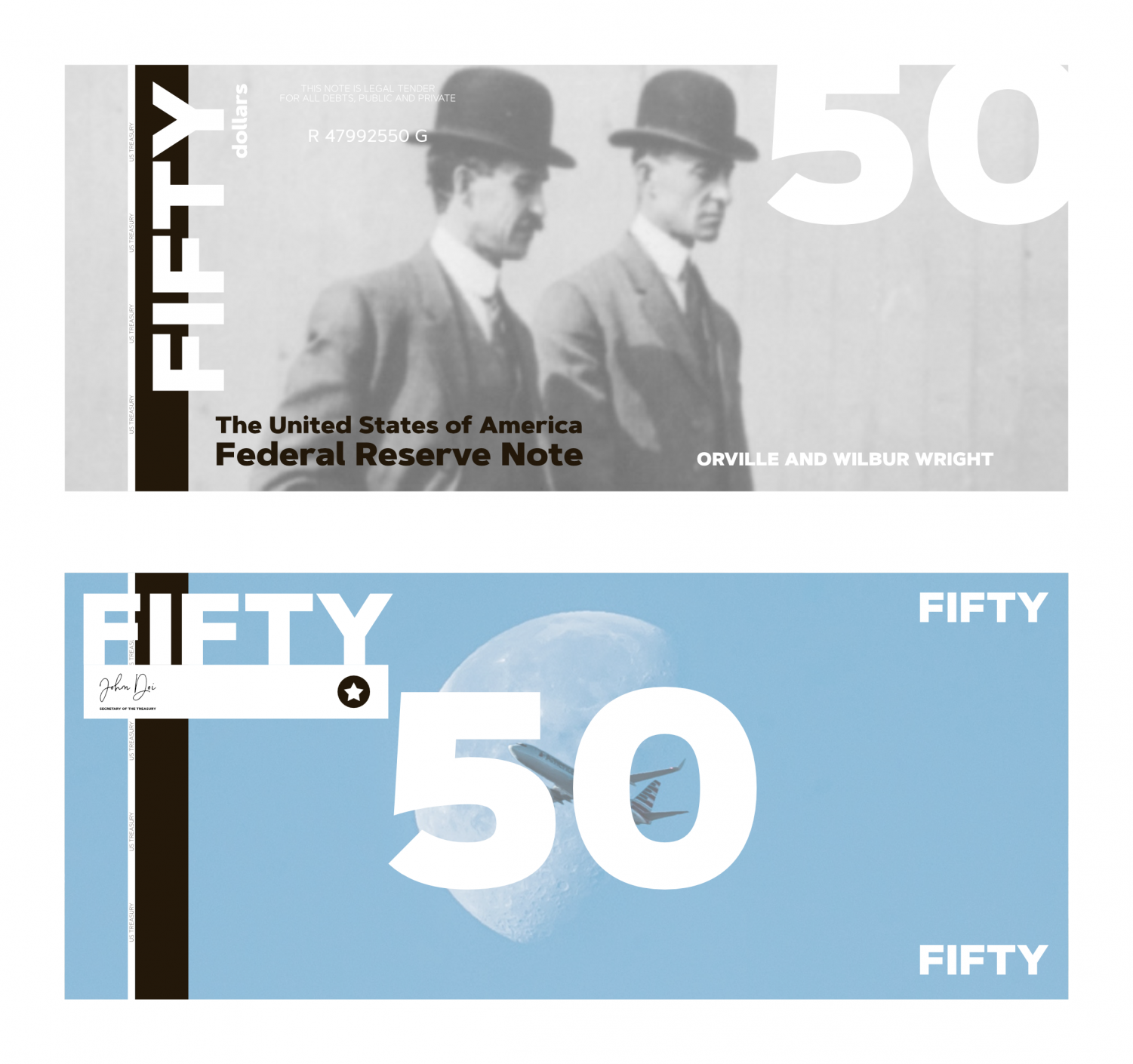
Even though the majority of the people featured on U.S. currency are early presidents, it doesn’t need to be that way. Some very significant people who were not politicians have made significant advances for the country and the world as a whole. People like Rosa Parks, Martin Luther King Jr. and Eleanor Roosevelt made notable advances in advocating for equal rights for all ethnic groups. Harriet Tubman is well known for helping and supporting escaped slaves through the Underground Railroad. Neil Armstrong was the first person to step foot on the Moon, and the Wright Brothers invented the first airplane. The work of Samuel Morse with the telegraph and Morse code was frequently used during war times for secure communication. Without the work of these significant American figures, the country may be a very different place today, which is why I have featured them on my redesigns.
The front of my bills feature a historically significant figure in U.S. history, such as Rosa Parks on the $1, Samuel Morse on the $5, and Harriet Tubman on the $20 bill. The back of the bills feature a modern picture that relates to the person or people on the front of the bill to provide that modern touch to the bills.
Other than the number or the portrait on the bill, there is little indication as to the denomination of a bill. Because of this, one of my ideas for redesigning the currency is to have color-coded bills based on their denomination. In my redesign, each denomination has a different color, which makes it easier for people to quickly differentiate between the different bills, which could also greatly speed up the process of cash transactions. Additionally, these colors can be identifiable by color-blind people by using colors that can be differentiated between each other.
Another feature of my currency redesign is that the bills have braille stamps, which presses the denomination into the bill in braille, so blind people can easily differentiate between the bills without being able to see.
These currency redesigns better fit with modern society, make it more appealing for consumers and make it easier for all people to conveniently use. In addition to my currency redesigns, submit your own currency redesign ideas at lhsdoi.com/submit for a chance to be featured online. Please note that this submission form may be closed at any time without notice.
$2 Note
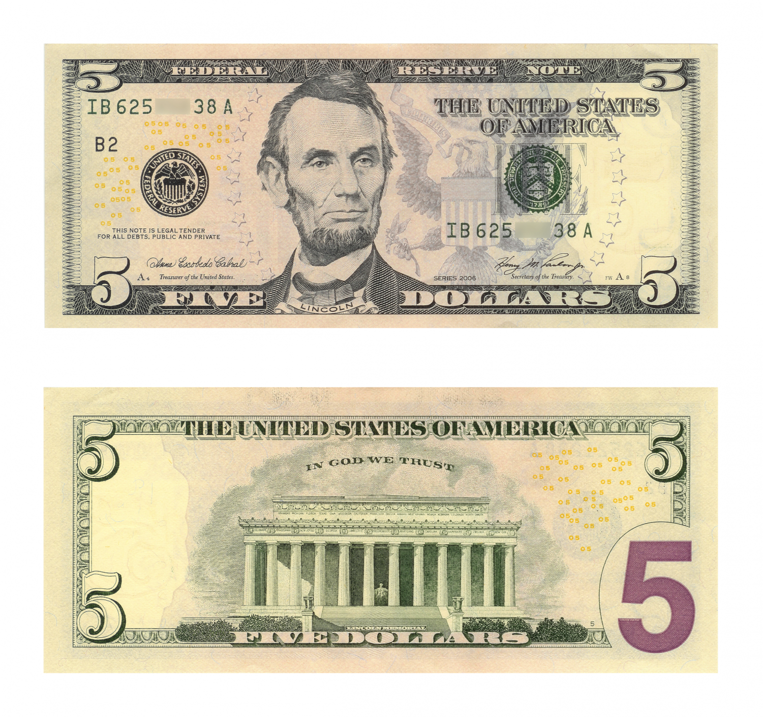
$5 Note
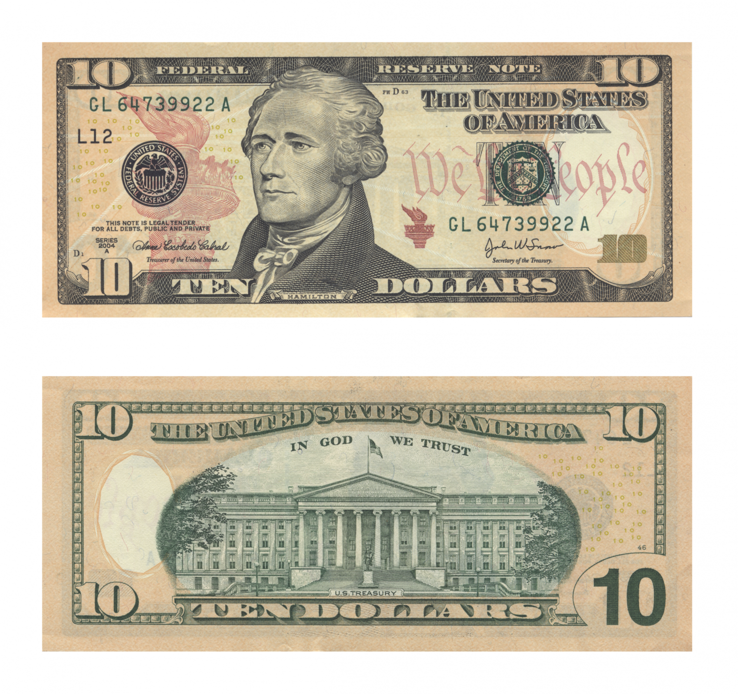
$10 Note

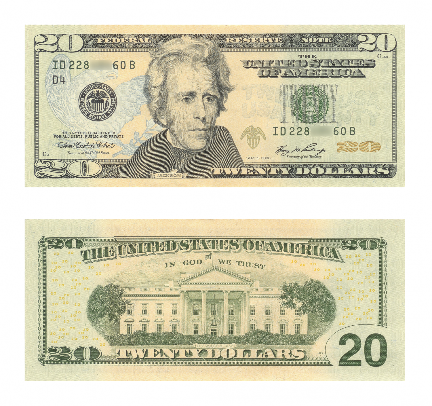
$20 Note
$50 Note
$100 Note


Odell Beverly Sr • Sep 16, 2020 at 8:40 am
I think the money should stay the way it is I think the history is lost when you remove a person from history I guess if you want to make more notes with new people that would be okay